The Υ and Ξ diagnostics
Every Bayesian analysis quotes a posterior width. Two separate things can go wrong with it, and the field’s standard diagnostic — the PP plot — sees only one of them. This page defines the two numbers the paper uses instead, \(\Upsilon\) and \(\Xi\), shows why together they are strictly more informative than a PP plot, and how to read them.
Three widths, two ratios
For one parameter \(\theta\), three different widths are in play:
- \(\sigma_{\rm quoted}\)
the width the analysis reports — the posterior standard deviation your chain gives you.
- \(\sigma_{\rm scatter}\)
the width the point estimate actually has: repeat the experiment over noise realizations and measure how the recovered \(\hat\theta\) fluctuates about the truth (systematic offsets included).
- \(\sigma_{\rm exact}\)
the width of the exact analysis of the same data — the information the data actually hold. No honest analysis can beat it.
The two diagnostics are the two independent ratios:
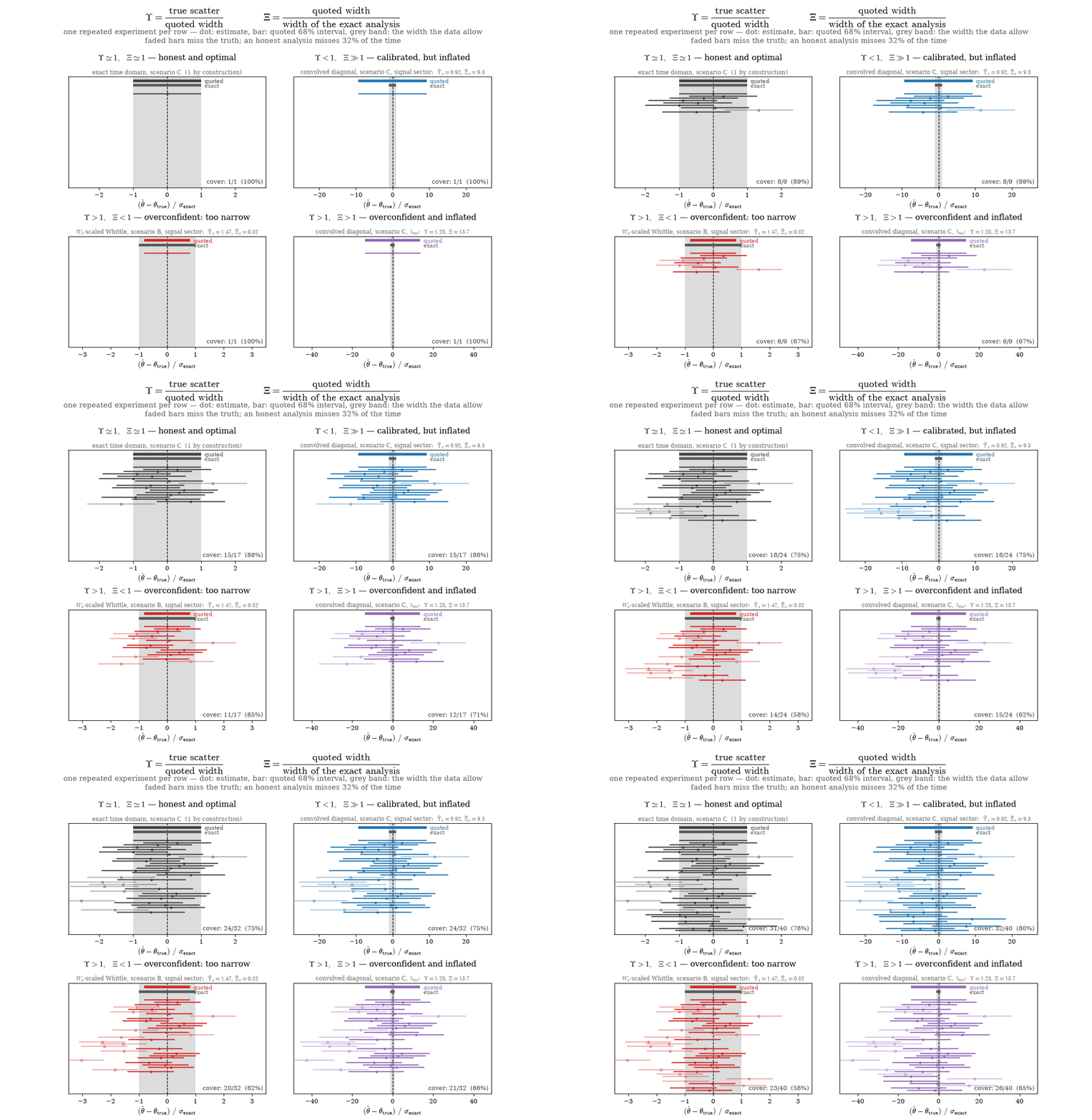
\(\Upsilon = 1\) means the quoted interval means what it says; \(\Upsilon > 1\) is overconfidence (the estimates scatter beyond the bars), \(\Upsilon < 1\) is conservatism. \(\Xi = 1\) means the quoted width is the width the data allow; \(\Xi > 1\) means information was thrown away, and \(\Xi < 1\) means the analysis claims information the data do not hold.
Their product is constrained: \(\Upsilon\,\Xi = \sigma_{\rm scatter}/\sigma_{\rm exact} \ge 1\), with equality only for the exact analysis. That is the information bound — an analysis in the “forbidden” corner \(\Upsilon < 1,\ \Xi < 1\) would outperform the exact likelihood.
The four realizable regimes, each anchored to a measured value from the paper (repeated experiments, one per row; the grey band is \(\pm\sigma_{\rm exact}\)):
The mathematics
Everything is computable analytically, at Fisher level — no injection campaigns and no sampling. Let the analysis use a model covariance \(\Sigma'\) while the data are truly drawn with covariance \(Q\), with independent channels \(c\) of identical covariance (\((\cdot)^{+}\) denotes the pseudo-inverse on the observed subspace — the gated covariance is singular, exactly as in the paper). For the signal parameters, three matrices decide everything:
(These are the complex frequency-domain forms the pipeline evaluates; the paper’s real time-domain expressions, Eqs. 76–82 there, are the same quantities under the DFT.)
\(F'\) is the Fisher matrix the model believes: the quoted covariance is \(F'^{-1}\). But the maximum-likelihood estimate is a linear functional of the data, and the data carry \(Q\), not \(\Sigma'\) — so the estimate actually scatters with the sandwich covariance \(F'^{-1} M F'^{-1}\) (Godambe–White; the paper’s Eq. 80). And \(F\) is the Fisher matrix of the exact analysis. Per parameter \(a\):
When the model is correct (\(\Sigma' = Q\)) all three matrices coincide and \(\Upsilon_a = \Xi_a = 1\) identically. For the noise parameters the same construction runs through the score of the Gaussian likelihood, with one addition: a mis-specified noise model is also biased, and the systematic offset \(b_a\) is folded into the scatter,
so noise-sector overconfidence from bias and from underquoted widths are caught by the same number. This is exactly the paper’s Eq. (78): its first term is the score-covariance sandwich (\(\mathrm{Var}[\hat\lambda]\)), and its second — the product of two mean-score traces — is the outer product of the leading-order bias, \(b_a b_b\).
In this repository the implementation is
paper/diagnostics.py
(ApproxModel.upsilon_s, .xi_s, .upsilon_n, .xi_n, plus the
Godambe–White sandwich and KL pseudo-true bias for the nonlinear noise
sector); paper/dump_upsxi.py tabulates every scenario and model tier into
paper/results/upsxi_dump.json.
When is the linearised \(\Upsilon\) enough?
The linearised expression above and the Godambe–White sandwich are the same object evaluated at two different points: the first takes one Newton step from \(\lambda^{\rm true}\), the second sits at the pseudo-true point \(\lambda^\star\). They therefore agree exactly when \(\lambda^\star = \lambda^{\rm true}\), which happens whenever the model reproduces the true diagonal of the windowed covariance — then the expected score vanishes term by term. That is a property of the model, not of the gap pattern: the full covariance and the convolved diagonal hold it across gap patterns from one 2 h gap to a 57-gap comb, their two \(\Upsilon\) curves agreeing to \(10^{-5}\) while \(\Upsilon\) itself climbs from 1.15 to 1.43.
Note this is weaker than the information equality. The convolved diagonal still has \(J \neq H\) — that is exactly why its \(\Upsilon\) exceeds 1 — so it still needs a sandwich; the point is only that the sandwich may be evaluated at \(\lambda^{\rm true}\).
Away from that point the two part company at a rate set by how far
\(\lambda^\star\) has moved: to leading order the relative error of the
linearised formalism is \(\tfrac{1}{2}\ln 10\,|\Delta\lambda^\star| \simeq
1.15\,|\Delta\lambda^\star|\), with \(\Delta\lambda^\star\) in dex (fitted
prefactor 1.14 over four decades). For the raw PSD and the scalar \(W_c\)
correction \(|\Delta\lambda^\star|\) never drops below 0.17 dex — the 5%
segment-edge Tukey window alone mis-specifies them — and the linearised
\(\Upsilon\) overstates the sandwich by up to a factor of 41.
paper/fig_upsilon_formalisms.py reproduces the comparison.
Why not just a PP plot?
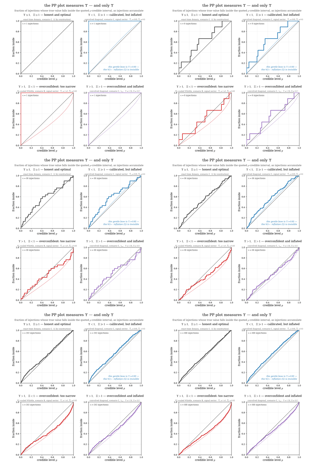
A PP plot answers one question: over many injections, does the true value fall inside the quoted \(p\)-credible interval a fraction \(p\) of the time? For Gaussian posteriors of quoted width \(\sigma_{\rm quoted}\) and true scatter \(\sigma_{\rm scatter}\), the expected curve is, with \(z_p = \Phi^{-1}\!\big(\tfrac{1+p}{2}\big)\) (unbiased case),
The right-hand side contains \(\Upsilon\) and nothing else. A PP plot measures calibration only: \(\Xi\) does not appear. An analysis quoting intervals ten times wider than the data allow, but calibrated, produces a diagonal PP plot indistinguishable from the exact analysis — as the second panel below shows with the paper’s own convolved-diagonal case (\(\bar\Upsilon_s = 0.92\), \(\bar\Xi_s = 9.3\) in scenario C):
Three practical advantages over the PP plot follow:
The blind spot is closed. \(\Xi\) measures precisely the thing a PP plot cannot see: how much information the analysis wastes. The paper’s drastic-comb scenario is the cautionary tale — the convolved diagonal passes any PP test while quoting intervals 8.6–10.2× wider than the exact analysis of the same data.
No injection campaign. A PP plot needs hundreds of end-to-end analyses before its staircase settles (watch the early frames above); \(\Upsilon\) and \(\Xi\) are closed-form Fisher-level quantities, evaluated once, exactly — and small miscalibrations that finite-injection noise would bury are visible immediately.
Per parameter, and signed. A sagging PP curve says “something is off”; \((\Upsilon_a, \Xi_a)\) says which parameter, in which direction (overconfident vs conservative, inflated vs too narrow), and by how much.
How to read them
\(\Upsilon\) |
\(\Xi\) |
verdict |
paper anchor (Table III) |
|---|---|---|---|
\(\simeq 1\) |
\(\simeq 1\) |
honest and optimal |
exact time domain (1 by construction) |
\(< 1\) |
\(\gg 1\) |
calibrated but inflated: right answer, loose bars |
convolved diagonal, scenario C, signal sector: \(\bar\Upsilon_s = 0.92\), \(\bar\Xi_s = 9.3\) |
\(> 1\) |
\(< 1\) |
overconfident: bars too small to be true |
\(W_c\)-scaled Whittle, scenario B, signal sector: \(\bar\Upsilon_s = 1.47\), \(\bar\Xi_s = 0.82\) |
\(> 1\) |
\(> 1\) |
the worst of both: wide and wrong |
convolved diagonal, scenario C, \(\lambda_{\rm tm}\): 1.23, 13.7 |
Signal-sector entries are the paper’s averages over the 11 signal
parameters; per-parameter values (Fig. 7 of the paper) regenerate with
paper/dump_upsxi.py.
Rules of thumb:
\(\Upsilon\) is the honesty factor of the error bar. Multiplying the quoted width by \(\Upsilon\) restores (approximate) calibration — so \(\Upsilon = 1.5\) means every quoted interval should really be 1.5× wider.
\(\Xi\) is the price in effective sensitivity. Because both the curvature and the score variance are quadratic in \(\partial h/\partial\theta\), an analysis with \(\Xi \gg 1\) behaves, at leading order, as though the SNR were smaller by that factor — an approximation with \(\Xi \approx 10\) turns an SNR-300 event into an effectively SNR-30 one, at every loudness.
The product is the total price. \(\Upsilon\,\Xi = \sigma_{\rm scatter}/\sigma_{\rm exact}\) compares your estimator head-on with the exact analysis; 1 is attainable only by being both calibrated and optimal.
Failure modes differ in kind. The convolved diagonal fails by inflation (\(\Upsilon \lesssim 1\), \(\Xi \gg 1\)): not a confidently wrong answer, but a correct answer with error bars an order of magnitude too loose. The Whittle tiers fail by overconfidence (\(\Upsilon > 1\), \(\Xi < 1\)) — and in the noise sector, catastrophically so (sandwich \(\Upsilon\) up to \(\sim 10^2\), driven by a pseudo-true bias).
Explore
The whole picture is interactive:
the Υ–Ξ explorer has
sliders for \(\Upsilon\) and \(\Xi\) (they stop at the information bound
\(\Upsilon\,\Xi \ge 1\)), a draggable point on the \((\Xi, \Upsilon)\) plane
with the forbidden region hatched out, the paper anchors click-to-load, a
systematic-offset dial, and live repeated-experiment and PP views. It is a
single self-contained HTML file
(assets/upsilon_xi_explorer.html)
— open it in any browser, mid-talk included.
Both animations are rendered by notebooks/anim_upsilon_xi.py (numpy /
scipy / matplotlib only, deterministic); the anchor values regenerate with
paper/dump_upsxi.py. See Reproducing the paper.